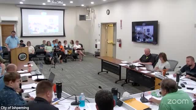
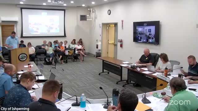
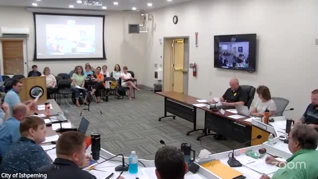
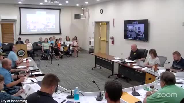
The City of Ishpeming is set to unveil a refreshed visual identity following a presentation on rebranding during the recent city council meeting held on September 17, 2025. The council reviewed updated logo options that reflect community feedback and the natural beauty of the Ishpeming landscape.
Elena Mueller Younger, representing the design team, shared the new branding concepts, emphasizing a color palette inspired by local elements, particularly the iron ore that characterizes the region. The proposed logos aim to replace the previous bright orange with more earthy tones, aligning with the community's identity and heritage.
The rebranding initiative is part of a broader effort to enhance the city's image and promote local pride. The steering committee, which gathered input from residents and stakeholders, played a crucial role in shaping these designs. The updated logos are expected to resonate with both residents and visitors, reinforcing Ishpeming's unique character.
In addition to the rebranding discussion, the meeting included a review of public safety initiatives, although no public hearings or unfinished business were addressed. The council's focus on branding signifies a commitment to fostering a cohesive community identity and improving the city's overall appeal.
As the city moves forward with this rebranding effort, residents can anticipate a more unified visual representation of Ishpeming that honors its history and natural surroundings. The next steps will involve finalizing the logo designs and implementing them across city materials and signage.