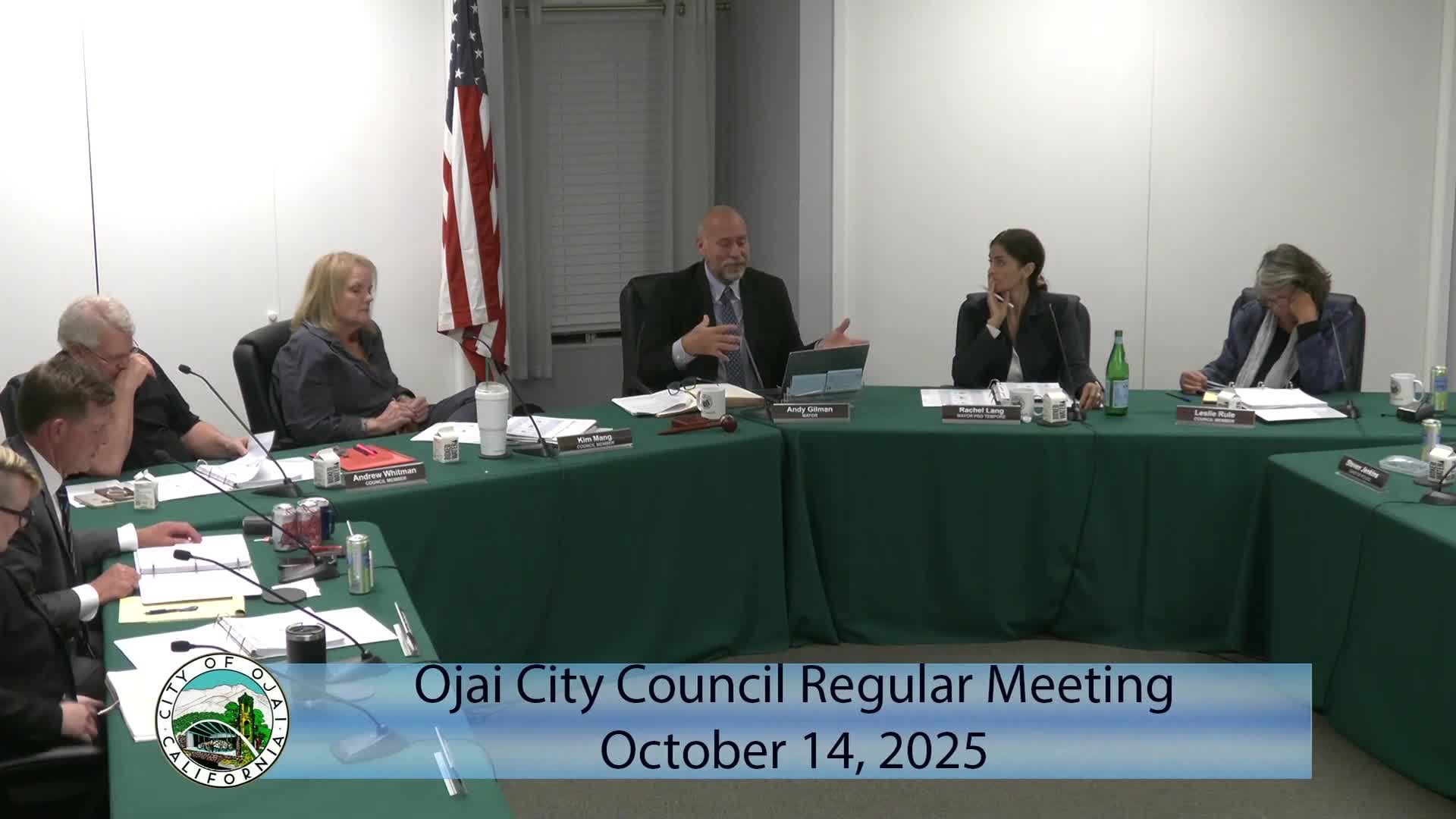
Council reviews new logo options; asks for refined color and font choices before final selection
Get AI-powered insights, summaries, and transcripts
Subscribe
Summary
Council reviewed three logo concepts and two color palettes proposed by the city’s design contractor, and gave direction to refine color tones and font options; several councilors favored circular designs with a tower and tree motif.
Council members reviewed alternate logo concepts and color palettes prepared by the city’s design consultant and provided guidance to staff and the designer on next steps.
The options presented included circular and tile motifs featuring an iconic local tower, mountains, a tree and sun rays. Council members discussed the role of the official city seal (retained for formal/legal documents) versus a modern graphic logo for general communications. Several councilors favored the circular tower + tree option (versions labeled “1c” and “2c” in the packet) but asked the designer to explore richer, more distinct earth‑tone palettes, and to present two or three font choices appropriate for municipal communications. One council member recommended against broader community review through the Arts Commission for a municipal logo and said logo selection is an operational communication decision.
Councilors asked staff to return with color swatches (PMS or digital equivalents) and font options, and requested that the designer prepare small‑scale mockups (business cards, PowerPoint slide header, vehicle decal) to test legibility at different sizes.
Ending: Staff will ask the designer to refine the favored concepts (c variants), provide specified color swatches and font alternatives, and include application mockups for final consideration.
