Hushton DDA pauses logo approval after member feedback, tables decision
Get AI-powered insights, summaries, and transcripts
Subscribe
Summary
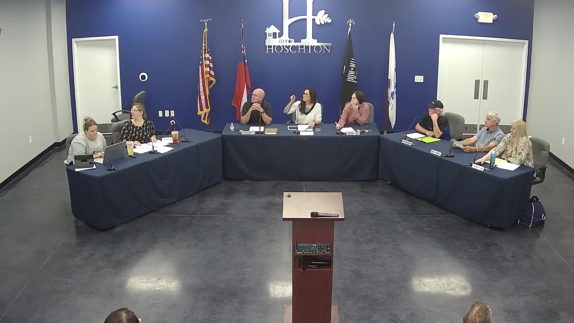
The Hushton Downtown Development Authority discussed a proposed rebrand featuring the town’s water tower and alternative color schemes, then voted to table final logo approval for further revisions and review.
The Hushton Downtown Development Authority discussed a proposed new logo and branding during its meeting and voted to table final approval after receiving member feedback and suggestions for revisions.
Board members described the proposed branding as a “fresh start” tied to recent changes in the board membership and suggested the water tower as a prominent visual element. One board member said, “If I'm being quite honest, I don't like our logo. It's maybe outdated. I think a fresh beginning and fresh start is what I would look toward.” Other members questioned whether the water tower should be the primary symbol and asked whether the change was necessary given the city’s existing mark.
Suggestions from the floor included using a circular mark for social media, placing an “H” on the water tower, simplifying color choices (gray and blue), and using the acronym “DDA” on some versions for legibility. A board member summarized proposed layout changes: move the water tower up, remove “It’s happening in Hushton” from the top, and keep “Downtown Development Authority” under the tower.
After the design discussion, a motion to table the logo approval was made and carried by voice vote; one board member later clarified motion/second names for the record at the end of the meeting regarding the logo item, but the transcript does not capture a completed roll-call on the original approval attempt. The transcript records: “Okay. I'd like to make a motion to table the, logo approval. Alright. All in favor?” followed by “Aye.”
The board intends to continue revising the designs and to revisit the logo at a future meeting once members and staff incorporate the suggested changes.
