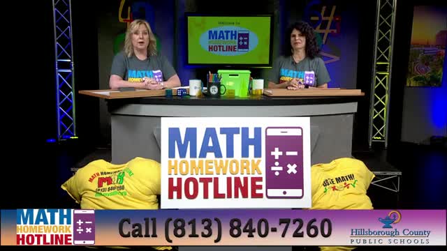
Math Homework Hotline ends season with hands-on lesson on data displays
Summary
Hosts Maggie Mixon and Canelo Alfredo used the season finale to review histograms, box plots, stem-and-leaf plots, line/dot plots and measures of variation, working through classroom-style examples and taking calls from students across Hillsborough County.
Math Homework Hotline hosts Maggie Mixon and Canelo Alfredo used the program’s season finale to review core ways to visualize and interpret data for middle-school students, focusing on histograms, box plots, stem-and-leaf plots and line/dot plots.
The review aimed to help students prepare for end‑of‑year assessments and accelerated sixth‑grade coursework; the live broadcast was produced by Hillsborough County Public Schools and promoted callers and classroom interaction on mathhomeworkhotline.org and local cable channels. "Tonight's topic is data displays," Canelo Alfredo told listeners as the show began.
The hosts front‑loaded the lesson with practical rules students can apply in class. Maggie Mixon explained the difference between bar graphs and histograms, noting that "a histogram has the bars that touch each other, that's the big thing," and walked through a sample histogram built from counts of peanuts per trail‑mix bag. In that example the hosts presented five bins (1–5, 6–10, 11–15, 16–20, 21–25) and read the counts into the display: 1–5 had 2 bags; 6–10 had 5; 11–15 had 4; 16–20 had none; 21–25 had 2.
The program also covered distribution shape vocabulary and a classroom mnemonic for skewness: Canelo Alfredo taught a “tail” rule and said, "Remember named by the tail, by the side of the tail," to help students decide left‑ vs. right‑skewed distributions. Teachers on the show described bimodal distributions as having two peaks and compared symmetric (normal) distributions to bell curves.
Hosts demonstrated stem‑and‑leaf plots and stressed the importance of reading the plot key; the show used an example where a key converted a row like "1 3 9" into 13.9 seconds for race times. For measures of variation the presenters explained when to use range versus interquartile range (IQR): with no outliers the range is appropriate, while IQR is used to reduce the effect of outliers on spread. In a live exchange on that point, Sophie, a caller, identified common measures and the hosts confirmed which to pick for the given stem‑and‑leaf example.
Maggie Mixon led a step‑by‑step explanation of box plots and the five‑number summary: the show read a class quiz box plot and identified the five numbers as minimum 71, Q1 74, median 79, Q3 81 and maximum 84. The hosts used that example to show how quartiles divide a class into four 25% segments and how to read median and extremes from a number line.
The broadcast also included line/dot‑plot examples. For a line plot of summer beach trips, hosts counted frequencies and reported that most students took 0 trips (frequency 8), with frequencies of 1 trip = 2, 2 trips = 4, 3 trips = 0 and 4 trips = 6. For a separate dot‑plot of library checkouts the presenters characterized the distribution as approximately normal and reported the counts by books checked out: 1 book = 5 students, 2 books = 9, 3 books = 7, 4 books = 6, 5 books = 4.
Students called in to answer questions and explain reasoning. One caller, Pragati, answered a multiple‑choice challenge about which display fits categorical data: "I think it was bar graph," she said, which the hosts confirmed (categorical data are best shown with bar or pie/circle graphs). The live interaction was used repeatedly to model how to interpret data displays without constructing them from scratch.
The program highlighted classroom practice and sponsors. Hosts announced giveaways and named student winners and thanked sponsors Edgems, Domino’s, McDonald’s and Mathnasium. They also introduced a Teacher of the Year award based on call volume across the season and said results would be published on the show’s social channels at the start of the next season.
As the broadcast closed, the hosts summarized the five display types covered — histograms (intervals and touching bars), stem‑and‑leaf (requires a key), box plots (five‑number summary), line/dot plots (frequency by category) and identification of skewness/bimodality — and urged students to review the rebroadcasts and online resources.
The show ended by noting the broadcast was the season finale for 2024–25 and that reruns and on‑demand episodes remain available on the program website and local cable channels.