Get Full Government Meeting Transcripts, Videos, & Alerts Forever!
Get email alerts on the Signage topic
No spam. Unsubscribe anytime.
Ithaca planning board presses developers to scale signage at Cayuga Park
Summary
Developers presented a unified sign package for the Keuka/Cayuga Park mixed‑use campus; planners and board members pressed for smaller, less illuminated building signage and clearer monument and wayfinding signs that prioritize navigation to Cayuga Health.
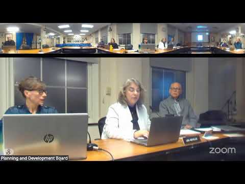
Developers and sign fabricators returned to the Planning and Development Board of the City of Ithaca on Feb. 25 with a revised sign package for the Keuka Park/Cayuga Park campus, presenting blade signs for residential buildings, two freestanding monument signs at the Route 13 and Third Street entrances, and four internal wayfinding panels.
Board members said the site needs clearer navigation to the Cayuga Health building and retail, but expressed consistent reservations about large building branding and illumination on residential structures. “I don't see the need to brand these buildings,” said Andy Roman, member of the board, arguing the residential buildings should read as neighborhood housing rather than commercial landmarks. Several board members said monument signage should be smaller and make room for tenant identification for retail uses.
Why it matters: Keuka/Cayuga Park combines medical, residential and retail uses. Board members framed the design choices as one of balance — navigation for patients arriving at the Cayuga Health building versus preserving a more residential street character for the Aurora apartment buildings and Marketview retail.
Developers said the package responds in part to requests from Cayuga Health and that consistent branding was important for patient wayfinding and retail leasing. Paul Colucci of DeMarco Group, one of the developers, said Cayuga Health has reported patient difficulty finding the building without a Route 13 entrance; he said the team coordinated signage with the medical tenant. Paul Dudley, president of ID Sign Systems, described the proposed blade signs as backlit aluminum cabinets with 12‑volt LED illumination and cut‑out lettering.
Board concerns and design direction - Illumination: multiple members urged against illuminated blade signs on residential façades. “They don't need to be illuminated,” Roman said, recommending any building signage be located at the Ground Floor or integrated into canopies, not mounted midway on residential façades. - Branding versus wayfinding: board members said the larger perceived audience for Route 13 is retail and medical traffic, while residential wayfinding should be subtler. Jenny Sutcliffe and others said the blade signs felt too healthcare‑oriented and suggested softer materials, additional planting or other treatments to create a neighborhood feel. - Monument signs and tenant space: board members asked the applicant to reduce the dominance of a single campus brand on the freestanding monuments and to ensure smaller spaces for retail tenant names. - Quantity and size: Basil Kori asked the team to consider cumulative square footage of signage, not just the count; several board members flagged potential light pollution from illuminated signs.
What the applicant presented - Sign count: the team said the proposal adds eight new signs in addition to signs already installed on two constructed buildings — two building signs and six site signs, including two monumental entrance signs and four internal wayfinding panels. - Materials and illumination: blade signs are fabricated aluminum with internal, low‑voltage LEDs intended to illuminate only the white text; monument signs would match building masonry and sit outside the DOT right of way. - Precedents: the team cited recent local blade‑sign approvals at City Centre and Art House as precedents and said they had revised earlier, larger proposals after prior board feedback.
Next steps and unresolved items The board did not take a formal vote on the sign package. Members asked the applicant to return with revised designs that reduce illuminated building signage, better differentiate retail tenant signage on the monuments, and demonstrate the proposed cumulative sign area and illumination schedules. The applicant acknowledged the comments and said they would return with modifications.
Ending: The board's comments were primarily design and testable: reduce residential façade illumination, shrink monument dominance, and clarify tenant signage; the applicants will bring revised artwork and additional detail at a future meeting.