Working group debates 'Envision Needham Center' logo and color palette
Get AI-powered insights, summaries, and transcripts
Subscribe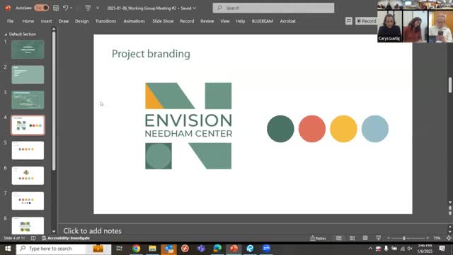
Summary
Project presenters showed a refined 'Envision Needham Center' logo and a five-color palette; working-group members debated whether to align the project palette with Needham’s traditional blue-and-gold colors and discussed legibility of the mark.
Project branding was the second substantive topic on Jan. 6, when the project team presented a refined logo and a focused palette of five primary colors for the Envision Needham Center outreach materials.
The lead designer described the mark as an abstracted “m” and “c” intended to produce graphic elements for flags, sandwich boards and QR-code collateral. The team proposed using two greens and two golds as a primary quad-tone scheme and offered grayscale and dark-background variants for different applications.
Why it matters: working-group members said branding will affect how residents recognize and respond to outreach. Several members argued the project identity should feel familiar and connected to the town, while others emphasized creating a distinct, time-limited project look so the outreach materials do not visually merge with other town communications.
Key points from the discussion
- Color and local identity: multiple members recommended keeping Needham’s traditional blue-and-gold palette or including it as an option so residents perceive the project as town-related. One member said, “I’m not certain why we’re getting away from the colors,” reflecting concern that unfamiliar color choices could reduce recognition.
- Legibility and mark interpretation: some members did not immediately read the mark as including a “C” and suggested clarifying the shape so “Envision Needham Center” reads unambiguously; others noted the abstracted shapes could tie to physical downtown details like wrought-iron elements.
- Time-limited project identity vs. long-term cohesion: some members supported a distinct project palette so the pilot’s materials read as a specific campaign rather than an extension of the town logo; others preferred closer alignment with existing municipal colors for consistency and public recognition.
Next steps
The design team said it will revise the mark and color options to respond to feedback, test variants that include Needham blue/gold pairings and return to the working group with updated samples. The team also plans to update the working-group page and story map language to match the “Envision Needham Center” project title and to present the refined boards at the next meeting.
Ending: The project lead committed to a follow-up design pass that addresses the group’s concerns on color alignment and mark clarity.