Get Full Government Meeting Transcripts, Videos, & Alerts Forever!
Get email alerts on the Branding topic
No spam. Unsubscribe anytime.
Colleyville council narrows water‑tower logo options, agrees to preserve original on older tower
Summary
Public works presented logo renderings for two new water towers; council favored an option that integrates the historic script with a CV monogram and directed staff to proceed with that design while leaving the original tower’s logo unchanged.
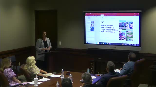
Public Works Director Lisa Sabito presented new logo renderings for two proposed water towers and the council favored a design that pairs the city's traditional script with a CV monogram and a blue border during the Aug. 5 work session.
The nut graf: staff showed multiple renderings for the Hall Johnson and McPherson towers and sought council direction on font, monogram placement and use of a blue border; council members indicated a preference for a design that references the old script while placing the CV monogram on the sides of the new towers, and they confirmed the city will retain the original logo on the existing older tower.
Sabito opened the discussion by explaining the two towers under consideration (Hall Johnson and McPherson) and showing renderings with variations: block letter Colleyville, cursive/script Colleyville and combinations with a CV monogram and a blue border. “I just wanna make sure everybody right now to where my dad is staying in my bed. Yes. That's the Bransford,” Sabito said while clarifying an older tower will keep its existing logo; she then showed renderings of the new towers and asked council members their preferences.
Council members discussed whether to place “Colleyville” on multiple sides and where to place the monogram; multiple council members said they preferred a rendering that ties the new towers to the city’s historic script and includes a blue border. One council member said the font from the older logo “is the font from the old 1 term,” and others said they liked the border and the painted tower look. A council member noted the importance of ensuring the style fits views from the business district corridors.
Council direction recorded at the session: proceed with the chosen script/monogram approach (the rendering that incorporates the traditional script and CV monogram with a blue border), maintain the original logo on the existing older tower, and return with final artwork for fabrication and painting. Staff confirmed they will proceed based on the preference expressed and coordinate orientation and paint selection.
Ending: Staff will carry the council’s direction into final design and return with final artwork and specifications for council review before installation.