Get Full Government Meeting Transcripts, Videos, & Alerts Forever!
Get email alerts on the Signage topic
No spam. Unsubscribe anytime.
Solvang design panel deadlocks on Final Girl Wines sign; applicant may appeal
Summary
The Design Review Committee split 2-2 on a motion to require a three‑dimensional hanging sign and eliminate a duplicate door sign for Final Girl Wines, leaving the applicant able to appeal to the City Council.
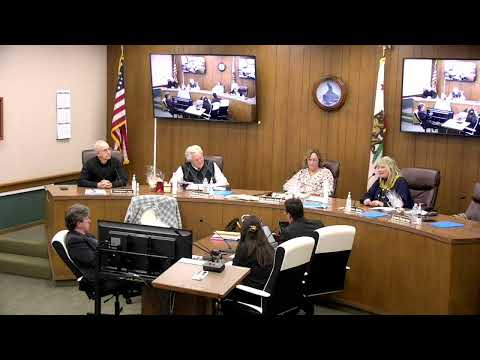
On Dec. 19, 2024, the Solvang Design Review Committee failed to approve a requirement that Final Girl Wines install a carved, three‑dimensional hanging sign and remove a duplicated sign on one of two front doors. The committee vote was 2-2, producing a tie; the motion failed and the applicant may appeal to the City Council.
The matter came before the committee after the business, a wine tasting room using the name Final Girl Wines, submitted plans showing a flat, printed sign with an uncommon decorative font. Supporters and local signmakers said a flat sign would be less expensive and easier to produce; others argued for the town’s historically dimensional, “old world” sign character.
City Attorney Dave, who joined the meeting by phone, said the committee’s legal exposure turns on whether it applies objective standards. “As long as there’s an objective standard by which to gauge the fonts so that an applicant has an understanding of what is and is not allowed, that would be more defensible,” he told the committee.
Brian of 805 Signs, who said he would produce many flat signs for clients, urged flexibility, saying a carved sign would be costly and in some cases difficult to manufacture. The Final Girl Wines representative described the business as “a tasting room” with a horror-themed brand; the applicant said the proposed sign was intended to reflect that identity.
Several committee members said they wanted to be consistent with past approvals for dimensional signs in Solvang’s primary commercial frontage. One member offered a motion directing that the hanging sign be three‑dimensional and that the duplicate wording on one of two French doors be removed; the motion received mixed support and, after a roll call vote, failed on a 2-2 split.
Because the committee did not adopt the requested conditions, the application can be revised and returned or appealed to the City Council, a staff member said following the vote. The committee did not make a finding on whether the font itself is content‑based; the attorney’s guidance placed the emphasis on creating an objective standard rather than ad hoc stylistic rulings.
The vote underscored ongoing tension at the committee between preserving Solvang’s “old world” visual character and allowing business signage that may be driven by brand needs or fabrication constraints. The matter was discussed at length in public comment and by the applicant and a professional signmaker; no final design change was approved.
What happens next: the applicant may file an appeal to the City Council or return to the committee with a revised sign proposal or additional information.