Get Full Government Meeting Transcripts, Videos, & Alerts Forever!
Get email alerts on the Branding topic
No spam. Unsubscribe anytime.
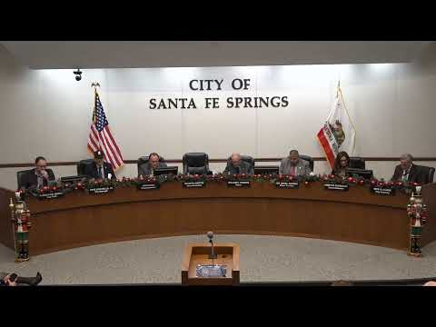
Consultant unveils new "SFS" brand concept for Santa Fe Springs; phased rollout planned
Summary
The council heard a branding presentation from Charlie Bell of 7 89 Inc., who showcased a proposed "SFS" monogram, explained the research and design rationale, and outlined phased brand guides and a December design milestone.
A consultant working with city staff presented a proposed city rebrand for Santa Fe Springs focused on an "SFS" monogram and a visual system intended to represent eight city priorities and three pillars (residents/community life, business/economic engine, city services).
Charlie Bell, president of 7 89 Inc., described the agency's research-driven approach and bilingual capabilities and said the monogram is motion-inspired and designed for applications from business cards to billboards and video. He explained that the logo contains eight sections representing priorities such as safety, service and community, and uses a three-color palette — a "springs blue" for future orientation, a pulse aqua for heritage/innovation and an industrial silver for the present.
Bell said the next steps include finalizing the brand guide, moving into design application and rolling out materials across signage, uniforms and communications; he told the council the team expected to have design materials available in December. Council members applauded the presentation and thanked staff for their work with the consultant.
The presentation did not include a formal council vote; the city manager noted the council has been involved in the process and staff will proceed with implementation planning.