Get Full Government Meeting Transcripts, Videos, & Alerts Forever!
Get email alerts on the Data Visualization topic
No spam. Unsubscribe anytime.
Wasatch County staff hear roadmap to make dashboards fuel faster decisions
Summary
Utah Valley University consultant Andrew Molleff led a Wasatch County government workshop on dashboards and data visualization, urging departments to focus on the right data, automate collection where possible, and treat data preparation as the time-consuming step while dashboard creation is quick once data is ready.
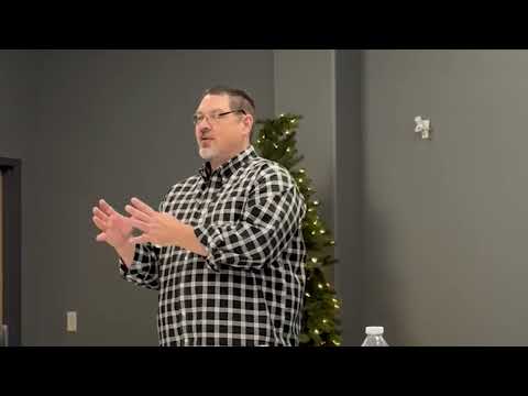
Andrew Molleff, a data consultant affiliated with Utah Valley University, led a workshop for Wasatch County staff explaining how dashboards and visualizations can help departments save time and make better decisions. He framed visualizations as "something that tells a story" and stressed that the goal of collecting data is to predict future needs and support faster decisions.
Molleff walked participants through examples ranging from raw NOAA temperature files to county-level population graphs and a municipal utilities dashboard from Flagstaff, Ariz. He said large datasets he works with can span millions of rows and that effective displays "simplify the complex database" so patterns and trends are visible without manual sifting. He cautioned that some public datasets require unit conversion (he cited NOAA’s temperature format) and that data has little meaning until it is processed into information.
The presentation emphasized the difference between data types and analytics stages. Molleff defined structured data (numerical rows and columns) versus unstructured inputs (emails, text and images), and described four analytics approaches: descriptive (what happened), diagnostic/interpretive (why it happened), predictive (what could happen) and prescriptive (what to do about it). He used a local sewer-pipe example to illustrate how predictive analytics can inform infrastructure sizing and future water needs.
A central practical point was the work split between data preparation and visualization. "Building the dashboard that shows you what's going on is the easiest part of data analytics," Molleff said; he estimated roughly 80% of the work is preparing and converting data so it becomes usable information. He recommended tools ranging from Excel and Google Sheets to Tableau and Power BI and urged staff to identify the 1–4 daily metrics that would most improve decision-making.
Molleff also encouraged automation of routine data capture where feasible. He offered examples—moving handwritten forms to electronic forms, using utility smart meters, fleet GPS, smart bins and automatic sensors—to reduce manual entry and errors. "When you can automate, you automate," he told the group, and described a project where 85 properties moved to automated forms to speed operations.
On privacy and data-generation, Molleff reminded staff that devices and platforms capture location and metadata; he said organizational devices, public Wi‑Fi and third‑party apps all produce records that can be incorporated into analyses, and he urged departments to consider veracity and trust in survey-derived data. He asked participants to align any new data collection to their department mission and values and to identify concrete action steps to secure missing data and build dashboards that answer specific operational questions.
The workshop closed with an exercise asking each participant to list 1–3 action items to improve data collection or visualization and whether they would share dashboards with departmental leadership. Molleff offered his UVU contact for follow-up and emphasized that once information is ready, dashboards can be updated frequently to support daily decisions.