Get Full Government Meeting Transcripts, Videos, & Alerts Forever!
Get email alerts on the Branding topic
No spam. Unsubscribe anytime.
Parkland commission narrows logo options, asks consultant for refined serif-based iterations
Summary
At a City of Parkland workshop, staff and consultant North Star presented six logo iterations. Commissioners favored serif wordmarks, richer palettes and simplified mark shapes (especially options 2, 4 and 6) and asked for refined mockups and comparisons to local marks; no formal vote was taken.
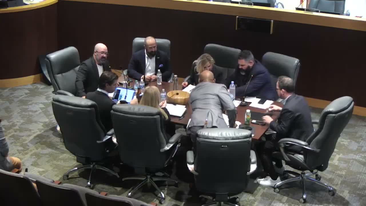
The City of Parkland commission reviewed six logo iterations at a workshop on the agenda item "City logo options," and asked consultant North Star to return with refined versions emphasizing serif wordmarks, deeper colors and simpler, more reproducible mark shapes.
Todd DeAngelis, the city's director of communications, introduced the presentation and said staff sought a mark "built by the community" that could be used on signage, athletic fields and merchandise. A North Star presenter summarized stakeholder input that new options should feel "more premium," use richer, warmer colors and employ a serif base so the mark reads as "elegant" and distinct.
The consultant presented a set of revisions to the existing mark plus five alternative concepts: a contained palm-form mark, a shield/crest with a stylized landscape, a p formed from a palm frond and horseshoe, and arabesque-pattern variations. The presenter emphasized one-color executions and signage mockups so commissioners could judge legibility at small sizes.
Commissioner Breyer praised the bolder lettering and the gold accents but asked for deeper blues, greens and browns to improve legibility and presence. Vice Mayor Israel and other participants repeatedly said they preferred the direction shown in options 2 and 4 and liked the boldness of option 6's wordmark; several commissioners asked North Star to simplify the swirling detail on some 'p' forms so the mark reproduces cleanly on hats and signs.
Jordan, a meeting participant, urged the consultant to ensure the new mark is clearly distinguishable from existing local logos such as the Parkland Golf identity, recommending a continued use of a shield frame in some iterations to preserve differentiation.
DeAngelis and the North Star presenter said staff wants a logo system (including a version reading "Parkland, Florida") with variations for different uses. Commissioners directed the firm to produce additional options combining the favored elements (serif wordmark, bolder base for the 'p', and simplified shield or contained marks), to show side-by-side comparisons with other local marks, and to provide palette variations with deeper tones.
No ordinance, contract or formal adoption vote occurred at the workshop; the session closed after a motion to adjourn was made and accepted. The presenter and staff said they will return with revised mockups incorporating the commission's feedback.