Get Full Government Meeting Transcripts, Videos, & Alerts Forever!
Get email alerts on the Branding Logo topic
No spam. Unsubscribe anytime.
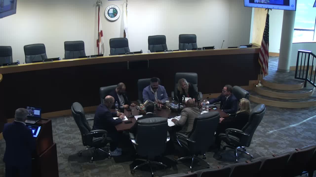
Parkland commission workshop narrows logo options and favors shield-style mark
Summary
At a City of Parkland workshop, commissioners reviewed logo iterations from vendor Northstar and signaled an informal 4–1 preference for a shield-style (bottom) iteration; staff will document reproduction guidance in a style guide and proceed with implementation steps.
City of Parkland commissioners reviewed a set of refined logo options from vendor Northstar at a workshop on Wednesday, Feb. 18, and signaled informal support for a shield-style iteration.
Northstar, the contracted designer, presented several variations that used the previously preferred type treatment and introduced subtle brushstroke texture in the wordmark. The vendor showed both stacked (icon above wordmark) and integrated (the icon as the letter P) treatments, plus an enclosed, shield-like version. The presenter said the palette had been deepened and the deliverable would include a brand style guide for varied applications.
Commissioners debated nuance—how much headroom to give the P, whether the top gold element read as a shield or a distinctive topper, and how the mark would reproduce on hats, shirts and embroidered goods. One commissioner said the shield option risked looking “too shieldy” and likened it to enforcement insignia, while other members argued the lower shield-style option read well in mockups and would reproduce cleanly.
Vice Mayor Bridal summarized the group’s direction and staff reported an informal 4–1 preference for the lower (bottom) shield iteration. The vice mayor asked for a show of tacit assent and a commissioner stated, “Cap’s been tipped,” which the group accepted as a unanimous tip-of-the-cap toward that option. Staff said the next step is to build the brand stylebook with guidance for stacked and one-color uses and to test embroidery and signage reproductions.
The commission did not take a formal recorded vote at the workshop; instead the group gave staff direction to proceed with the selected option and to include reproduction and implementation guidance in the forthcoming style guide.
What happens next: staff will incorporate the selected iteration into a brand style guide and report back with final production-ready files and implementation recommendations at future meetings or as part of routine communications rollouts.