Get Full Government Meeting Transcripts, Videos, & Alerts Forever!
Get email alerts on the City Branding topic
No spam. Unsubscribe anytime.
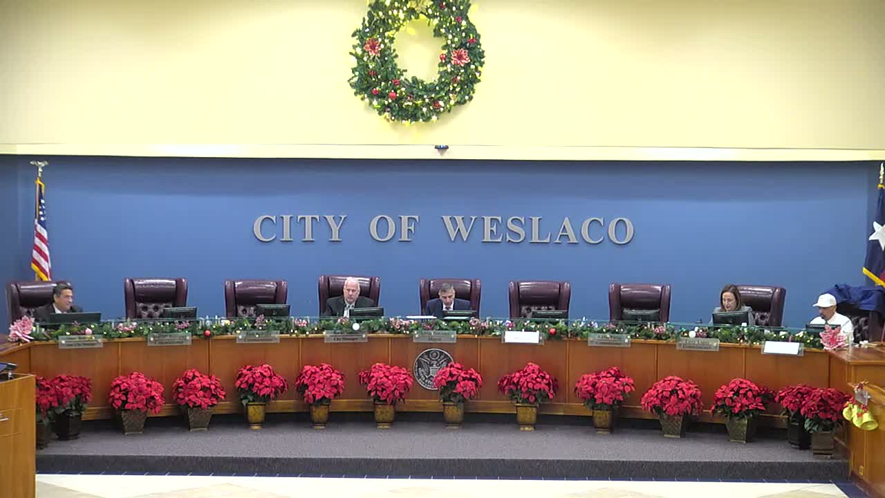
Weslaco commissioners press designer to simplify new city logo, weigh slogan options
Summary
At a Weslaco City Commission workshop, commissioners and staff reviewed a draft city logo from Luna Creative, asked the designer to simplify intricate elements and provide monochrome and metallic options, and requested alternative slogans and color palettes before the next draft.
Magali presented a first draft of a proposed city logo to the Weslaco City Commission, saying the design team and a Blue Ribbon Committee had prioritized a simpler, more modern mark after finding the current emblem "a little bit busy." The commission provided targeted feedback on imagery, color and slogan choices and asked staff to send consolidated edits to the designer for a revised version.
The presentation laid out the draft's symbolism: palm trees intended to reference the valley, a hidden "W" motif and the use of an onion color tied to local agriculture. "It's a little bit hidden, and you kind of have to see it," Magali said, describing the 1919 founding-date element and subtle design features embedded in the mark.
Commissioners and staff raised practical concerns about production and legibility. Magali and commissioners noted that the prior, more detailed logo had been difficult to edit for video, flags, podium plaques and small-format items. One commissioner favored a navy-blue and metallic-silver option for a sharper, more versatile application; another urged avoiding purple because it could create perceived favoritism toward local schools. Magali said the Blue Ribbon Committee also recommended dropping purple and testing a royal-blue palette with teal and a salmon accent.
Commissioners identified specific changes they want in the next draft: correct the "EST"/"established" typo, detach or reposition palm-tree elements that overlap letters, remove redundant structure lines that read like a double "W," and replace a varsity-style "1919" font with a less sporty treatment. Magali said those edits (recorded in handwritten notes from the Nov. 12 committee meeting) will be combined with the commission's input and submitted to Luna Creative for revision.
On the slogan, Magali presented options including "Center of the Valley," "Growth with Purpose," and "City of Opportunity." Several commissioners said "Center of the Valley" felt unappealing and suggested focusing on themes of opportunity or progress instead. "We already know we're the center," one commissioner said, arguing the slogan should offer a forward-looking message.
Magali said the design team will return with additional color and application options after incorporating the requested edits, including monochrome and metallic treatments for specific uses such as podium plaques, vehicle decals and apparel. The commission did not take a formal vote on the logo at the workshop; staff will coordinate revisions with Luna Creative and present a new draft at a future meeting.
The workshop then moved on to a separate agenda item on intergovernmental partnerships.