Get Full Government Meeting Transcripts, Videos, & Alerts Forever!
Get email alerts on the Data Tools Quarterly Services Survey topic
No spam. Unsubscribe anytime.
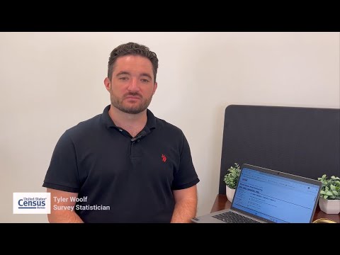
Census survey statistician demonstrates how to access Quarterly Services Survey data
Summary
Tyler Woolf of the U.S. Census Bureau demonstrates how to use the Quarterly Services Survey tools at census.gov/services to select industries, years and metrics, generate charts (bar, line, dot plot), and find release schedules and API access.
Tyler Woolf, a survey statistician at the U.S. Census Bureau, walks viewers through how to find, filter and visualize data from the Quarterly Services Survey (QSS) on census.gov/services. "What if you could get an early look at how the U.S. economy is moving before it becomes front-page news?" Woolf asks, framing the QSS as a timely source for industry trends.
Woolf says the QSS is a key source of timely, reliable data for the U.S. services sector and notes that "agencies like the Bureau of Economic Analysis use it to help produce key measures like the Gross Domestic Product (or GDP)." The video targets researchers, policymakers, business leaders and the public and shows how QSS outputs can be turned into charts and trend analyses.
He demonstrates the Time Series/Trend Charts tool: STEP 1, choose "Quarterly Services Survey"; STEP 2, specify a year range (the demo uses 2019–2025); STEP 3, pick an industry or NAICS category (the video shows NAICS 6244, child day care services, and later NAICS 5312, offices of real estate agents and brokers). Woolf selects data items such as total revenue or total operating expenses, clicks "Get data," and displays both seasonally adjusted and not-seasonally adjusted tables.
Viewers are shown how to change visualizations (bar chart, line chart, or a dot plot for percent-change items), and Woolf points out that any generated chart can be exported using the chart menu (the square with three lines). When demonstrating percent-change metrics for real-estate offices, he notes the option to produce a dot-plot instead of a bar or line chart.
On seasonal adjustment, Woolf explains: "Seasonal adjustment estimates remove seasonal effects from a time series to show changes in the direction of the industry that aren’t due to seasonality." He advises comparing adjusted and unadjusted series (for example, viewing Total Revenue instead of Total Revenue Percent Change on the line chart) to see seasonal effects.
The video also highlights supporting resources on the services page: the latest Quarterly Services Report, an API for programmatic access, and an option to get updates through the FRED app. Woolf says QSS data are released every quarter and points viewers to the SERVICES release schedule or to subscribe via the Contact Us section to receive notices about upcoming releases; the tutorial does not specify the next release date.
For step-by-step practice the video uses concrete examples (NAICS 6244 and 5312) and shows how to select items, get tables, and export charts. Woolf closes by directing viewers to census.gov/academy for more instructional videos and reminding them to subscribe.
The QSS tools demonstrated in the video let users filter by years and industries, choose among common data items (revenue, expenses and some industry-specific measures), toggle seasonal adjustment, and export visualizations for analysis. The Census Bureau’s Advance Quarterly Services Report provides an early-quarter snapshot used by federal agencies and analysts; users should consult the release schedule at census.gov/services for precise dates.