Get Full Government Meeting Transcripts, Videos, & Alerts Forever!
Get email alerts on the 144 Spring Street topic
No spam. Unsubscribe anytime.
Landmarks committee questions lighting, proportions and rooftop on proposed 144 Spring Street infill
Summary
Community Board 2’s Landmarks Committee expressed broad design concerns about a proposed two-story retail infill at 144 Spring Street, criticizing exterior uplighting, repetitive facade rhythm and the rooftop bulkhead and asking the applicant to revise and return.
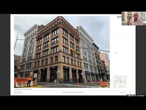
Cass Stackleberg, principal at Higgins Grace and Partners, and David Kubik, partner at BKSK Architects, presented a proposed two-story commercial infill for 144 Spring Street, a narrow vacant lot the team said has been empty since the 1940s. Stackleberg said the design “draws on the rich history of the Soho Cast-Iron Historic District” and described the proposed use of ultra-high-performance concrete (UHPC) so that panels could be pigmented and cast like historic ornament.
The project team showed a facade made of prefabricated UHPC columns and perforated spandrel panels, with a taller first-floor storefront and a modest second-floor setback, plus a small rooftop terrace and elevator bulkhead. Kubik explained the lighting strategy: recessed pin lights at the column bases and 1-by-1-inch uplights at the second-floor ledge intended to provide a “soft glow” and to “celebrate the architecture.”
Committee members pushed back strongly. Bo said he feared the proposal’s exterior lighting “would make it look like Miami,” and multiple members questioned the visual effect of uplighting a predominantly glass frontage rather than masonry. Several members called the lighting proposal attention-getting and unnecessary for the site’s scale.
Members also faulted the project’s proportions and rhythm. Brian and Anita said the ground and second floors read too similarly in height and that the building feels “upside down,” with an overweight top termination and a visually weak base. The committee criticized a uniform, repetitive pattern of identical bays and urged a clearer ground-floor storefront expression, a stronger cornice or parapet termination, and rethought proportions so the lower floor reads as the primary retail level.
The rooftop bulkhead and terrace drew repeated concern for visibility from the street. Committee members said the rooftop element is prominent on this narrow lot and asked the applicant to reduce its apparent mass or integrate it more convincingly into the building form.
On materiality and detailing, several members said the UHPC treatment read flat or cage-like in the current scheme and recommended more variation in panel depth, a stronger base treatment and reconsideration of continuous signage bands. The presenters defended UHPC’s ability to take fine embossed detail and noted code constraints on core and egress that shaped the two-story program and the rooftop volume.
No members of the public spoke during the public-comment period. After extended questioning and discussion the committee agreed to recommend denial of the submission as presented and asked the applicant to return with revisions addressing lighting (substantially reduced or reconfigured), clearer ground-floor expression and cornice/termination details, revised bay rhythm and proportional changes, and a less visually dominant rooftop bulkhead. Staff was asked to draft a resolution reflecting the committee’s objections and requested changes.