Get Full Government Meeting Transcripts, Videos, & Alerts Forever!
Get email alerts on the Signage topic
No spam. Unsubscribe anytime.
Pleasant Hill Architectural Review Commission directs larger, more legible signage for Nobuya Sushi & Izakaya
Summary
The Pleasant Hill Architectural Review Commission voted unanimously to require design changes to exterior signage for Nobuya Sushi & Izakaya at 1428 Contra Costa Boulevard, directing staff to approve a revised layout that reduces the logo size on the wall cabinet, enlarges English lettering to up to six inches, and places “sushi and izakaya” on a separate line.
The Pleasant Hill Architectural Review Commission (ARC) voted unanimously to approve staff-directed revisions to the exterior signs for Nobuya Sushi & Izakaya at 1428 Contra Costa Boulevard, asking that the front wall cabinet sign reduce the logo size and increase the English lettering to improve legibility.
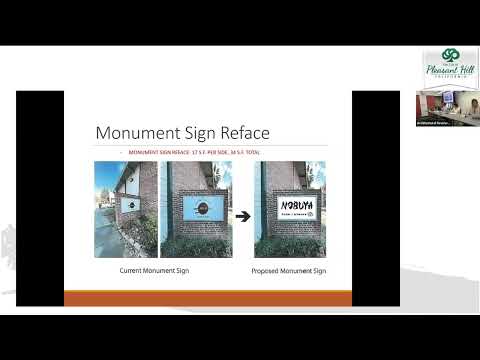
Planning staff opened the public hearing, describing a proposal that includes one new wall cabinet sign (a 6-inch-deep internally illuminated cabinet) and refacing of a small double-faced brick monument sign. Staff told the commission that the wall cabinet would cover a lighter, discolored patch of brick left by a prior sign and flagged two primary concerns: the citywide design guidelines generally discourage cabinet signs unless historically present or part of a master sign program, and the proposed English copy on the wall would be only about three inches tall, which staff said may be difficult for passing motorists to read.
Kyle, the sign installer who represented the applicant at the hearing, described the design choices as brand-driven: the exterior faces include a logo and language-specific characters so the business’s symbol appears in multiple scripts and the double-faced monument sign displays English on both sides for motorists approaching from either direction. Kyle said the owner had attempted power washing but that cleaning did not remove the discoloration, explaining the applicant’s choice to propose a cabinet sign that would conceal the affected brick.
Commissioners focused on legibility and visual consistency. Several commissioners and staff noted that interior signage echoes the proposed exterior fonts but that exterior faces differed from one another and could confuse customers who read English. Commissioners recommended enlarging the English text, bringing “sushi and izakaya” onto a second line beneath the restaurant name if needed, and scaling the logo slightly so type could be made more legible without changing the cabinet’s overall footprint. Staff confirmed city guidelines address proportionality and facade margins but do not specify an exact letter height for a sign face, and said staff could review modest text-size adjustments if the commission provided specific direction.
The commission made a motion to reduce the logo size on the front wall cabinet, increase the Nobuya text height up to six inches, place “sushi and izakaya” on a separate line (or otherwise improve legibility), and allow staff to review the revised layout for overall aesthetic sensibility and margin compliance; for the monument sign the commission agreed the Nobuya logo could remain largely as proposed while requiring the monument’s “sushi and izakaya” subtext to match the font chosen for the front sign. The motion was seconded and passed 4–0 (Commissioners Kapoor, Vice Chair Potari, Weir and Chu voted yes).
Staff had recommended the commission receive public testimony, accept any applicable CEQA exemption, and adopt the staff-recommended conditions of approval with modifications directed by the commission; the commission’s directions will be incorporated into staff review and final sign permits. The applicant may submit a revised sign face layout consistent with the commission’s direction for staff-level approval or return to ARC if changes exceed the scope the commission authorized at the meeting.
The ARC’s action is limited to exterior signage review under Pleasant Hill’s design guidelines; the commission did not direct painting of the facade or require interior sign alterations.