Get Full Government Meeting Transcripts, Videos, & Alerts Forever!
Get email alerts on the Innovations Waiver Dashboard topic
No spam. Unsubscribe anytime.
Presenter walks through Inclusion Connects dashboard for Innovations Waiver waitlist
Summary
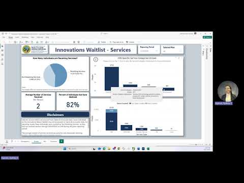
A presenter demonstrated the Inclusion Connects dashboard for the Innovations Waiver waitlist, showing how to use filters, view demographics and diagnoses, and read service metrics (average services = 2 per person; 82% of listed individuals have Medicaid). The walkthrough noted quarterly updates, planned enhancements and privacy suppression for counts under 11.
A presenter walked participants through the Innovations Waiver Waitlist dashboard—"otherwise known as the Inclusion Connects dashboard," she said—demonstrating how to navigate tabs, filters and interactive visuals to examine wait-list demographics, diagnoses and services.
The walkthrough focused on practical navigation and data context. "The important part of today's walkthrough is showing you how you can change visuals based on the information that you wanna see," the presenter said, demonstrating the reporting-period filter (quarterly) and selection tools that let users click a demographic bar or diagnosis to update all visuals on the page.
The demographics tab shows wait-list counts, gender breakdowns, age distributions and county locations on the left, with a scrollable diagnosis list and counts on the right. The presenter explained the diagnosis legend: light blue flags qualifying intellectual and developmental disability (IDD) diagnoses and dark blue indicates non-qualifying diagnoses.
On the services tab the presenter described five visuals that track service use for the selected reporting period (the example given was January–March 2025). She said the dashboard reports an average of two services per person for that quarter and that 82 percent of individuals on the wait list were listed as having Medicaid. She cautioned that published quarterly reports may show different percentage points because the dashboard includes a wider set of services.
The dashboard separates IDD-specific categories (care management, home and community services, respite and employment) and provides hover text and a visible "eye" icon to view category disclaimers and service definitions. The presenter also said the service-types visual includes non-IDD services such as mental health, substance-use disorder services, traumatic brain injury supports and crisis services; state-funded services are indicated in light blue.
Data-source and privacy disclaimers are prominent. The presenter noted that much of the underlying data comes from LME MCO quarterly reports and that contact information for the LME MCOs and the counties they serve is provided in the FAQ tab for county-specific questions. She also explained the privacy suppression rule: any category with fewer than 11 people is shown as "<11" to protect individual privacy.
The presenter closed by listing planned enhancements slated for the next 0.25 release, including a visualization to track current living arrangements for people on the wait list, and encouraged users to send feedback via the provided contact email.