Get email alerts on the Mapping Geography Profiles topic
No spam. Unsubscribe anytime.
Mapping and geography profiles on data.census.gov: address, tracts and visualizations
Summary
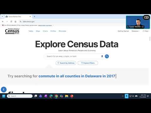
The presenter showed how to use search-by-address and the maps tab to view census tracts, visualized percent distributions (example: percent 65+ and veteran counts) and how to switch layers and variables for charts and maps.
Weister used the search‑by‑address tool to locate 111 Harbor Drive, San Diego, and then opened related geographies and tables. He noted S2101 (veteran status) for the selected tract shows "2,264 people 18 over" and "approximately 333 veterans, which is 14.7%" in his example, and demonstrated clicking Maps to view the census tract and street labels.
For mapping county tracts, he selected Barnstable County and mapped the ACS 5‑year variable "percent 65 and over," explaining how darker map shades represent higher percentages and showing an example tract with 57.6% age 65 and over. He also demonstrated creating charts from the same variable and sorting tracts by value.
AI generated
The text on this page is AI generated. Summaries, highlights, analysis, and video transcripts are all produced from the original source material.
AI can make mistakes, so if you spot one, and we will fix it for everyone.
Note: the source content is unaltered by us. Any content source we link to, be it a video, an audio recording, or a document, is presented exactly as its publisher released it. That publisher is usually a government body, sometimes an individual official or another organisation.