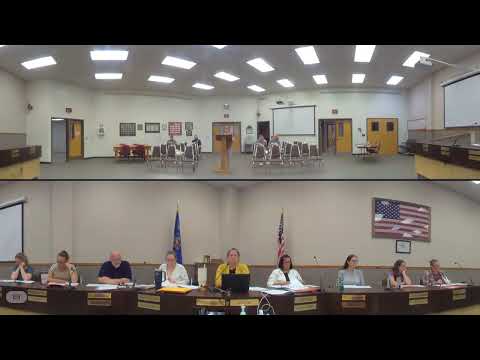
Committee reviews ADA design options for signs and public materials
Summary
Members compared design samples and discussed legibility, color contrast and font spacing to meet ADA readability standards; staff will confirm compliance and return recommendations.
Staff presented suggested design themes intended to comply with ADA readability requirements. Council members compared font options and color treatments, noting trade-offs between aesthetics and legibility for low-vision users. One member said the brown boxed layout "has a better readability" and another urged confirming whether samples meet accessibility thresholds before final selection.
The committee asked staff to confirm accessibility metrics with the designer (Nathan) and to return the final theme once it has been validated by the ADA-compliance tool referenced in the packet.
AI generated
The text on this page is AI generated. Summaries, highlights, analysis, and video transcripts are all produced from the original source material.
AI can make mistakes, so if you spot one, and we will fix it for everyone.
Note: the source content is unaltered by us. Any content source we link to, be it a video, an audio recording, or a document, is presented exactly as its publisher released it. That publisher is usually a government body, sometimes an individual official or another organisation.