Get Full Government Meeting Transcripts, Videos, & Alerts Forever!
Get email alerts on the Team Communication topic
No spam. Unsubscribe anytime.
Facilitator uses 'color energies' framework to spotlight council communication styles
Summary
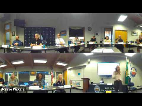
Facilitator Kelly led the council through a four-color preference tool — red, green, yellow, blue — to highlight how different communication and decision-making styles show up in meetings.
Kelly introduced a four-color framework meant to clarify how council members prefer to work and communicate. She described "fiery red" as task-focused and decisive, "earth green" as relationship- and listening-oriented, "sunshine yellow" as visionary and persuasive, and "pool blue" as cautious and detail-oriented. "Be brief, be bright, be gone," she said of the red tagline, explaining when the council should dial up different energies.
The facilitator walked members through brief paired exercises designed to surface which colors give them energy and which show up under stress. She asked participants to consider when the council needs more of a given energy — for example, red for same-day deadlines or blue when scrutinizing zoning details — and to note that each energy can be a strength or a liability when overused. Participants responded with examples: budget work was named as a situation requiring red and blue energies, while public-facing conversations may need green to foster trust.
Kelly cautioned that the colors are preferences rather than fixed personality labels and encouraged members to use the tool to "over declare" their intent in meetings so colleagues better understand motives and signals. The council then used physical blocks to indicate dominant and secondary preferences and discussed what the team wheel revealed about their collective balance.